Work
Personal travel brand
A travel journal
How do you make a travel membership feel like a personal journal rather than a sales funnel?

In short
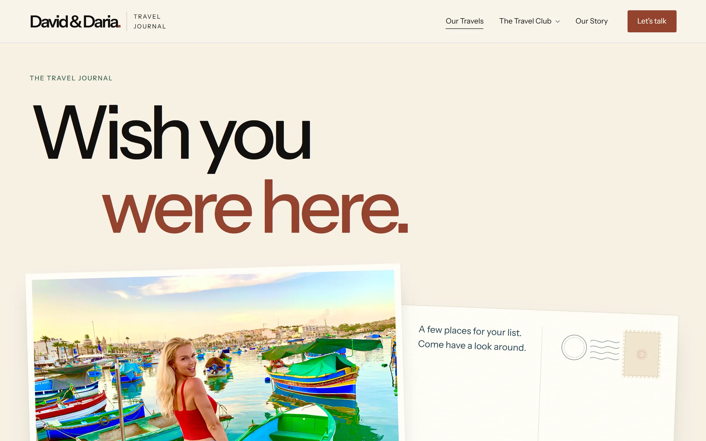
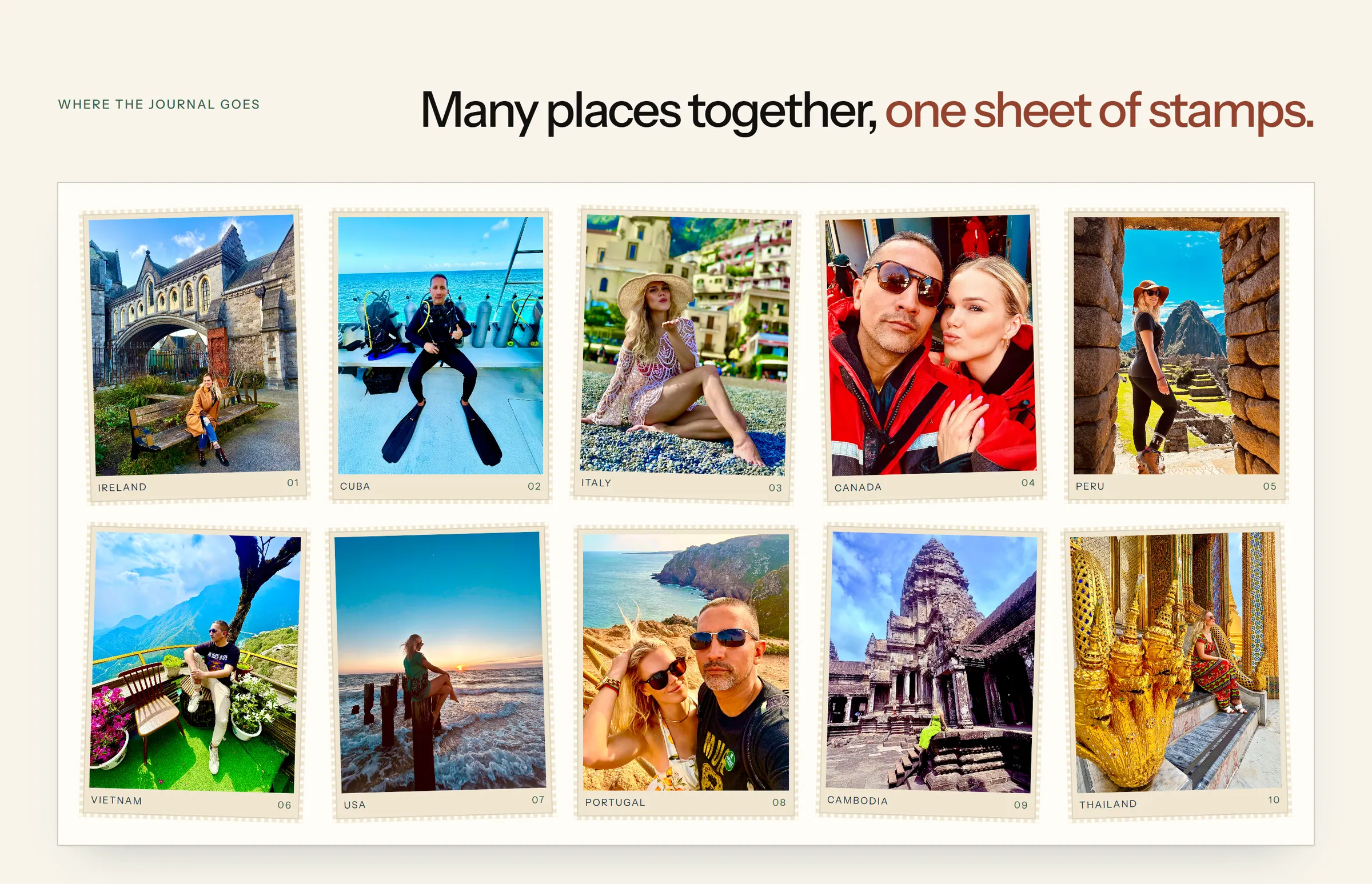
A journal that opens on load, a plane that crosses between chapters, and every country on one sheet of stamps.
What it looks like
On a phone
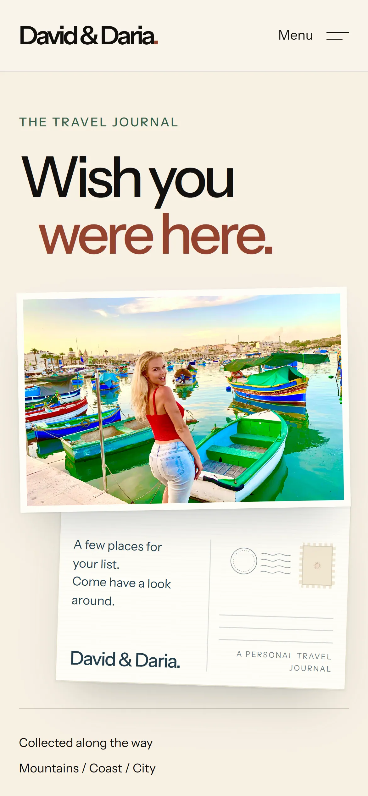
What I decided
- One readable typeface and native scrolling.
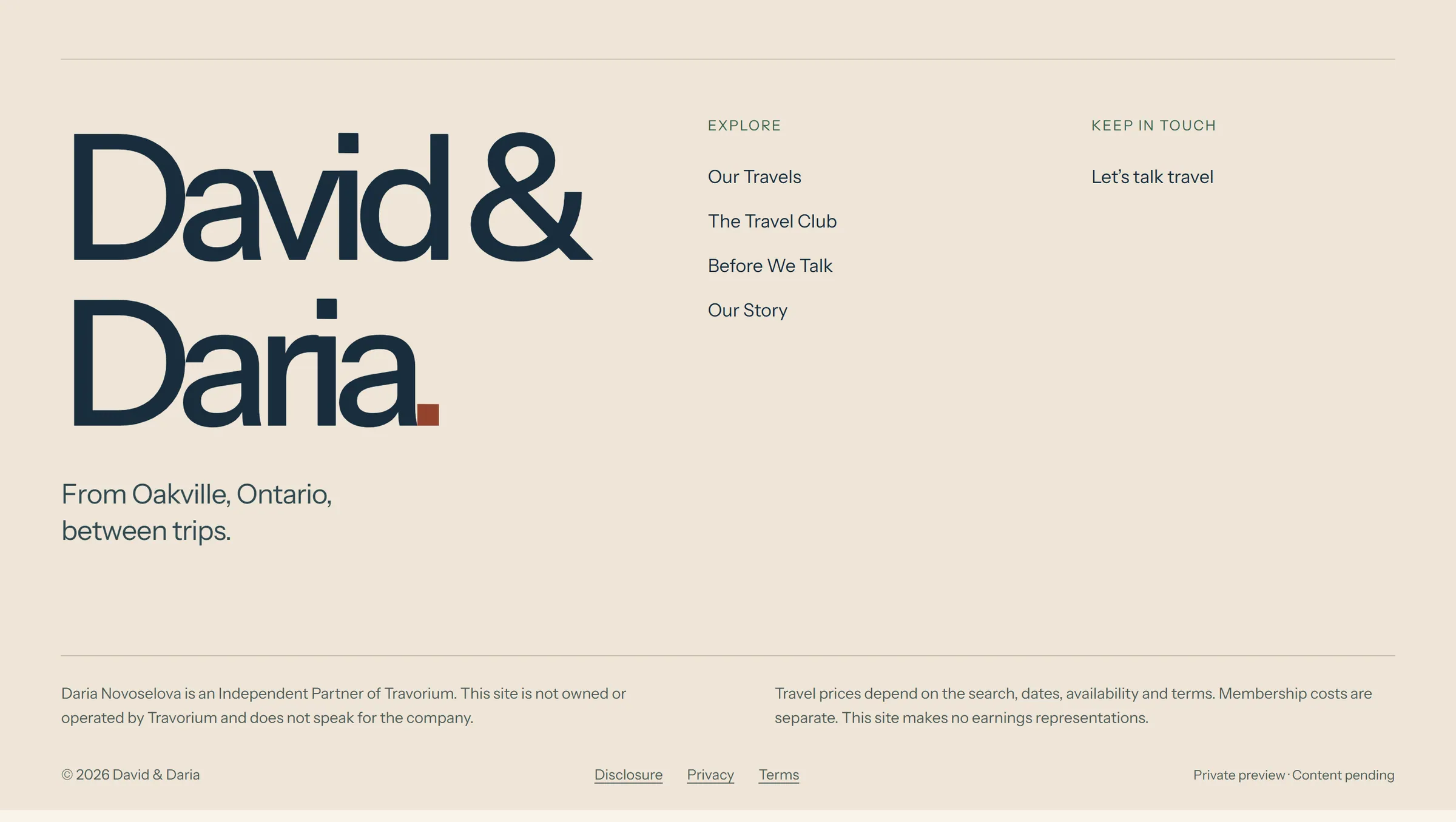
- Honest empty spaces where content did not exist yet.
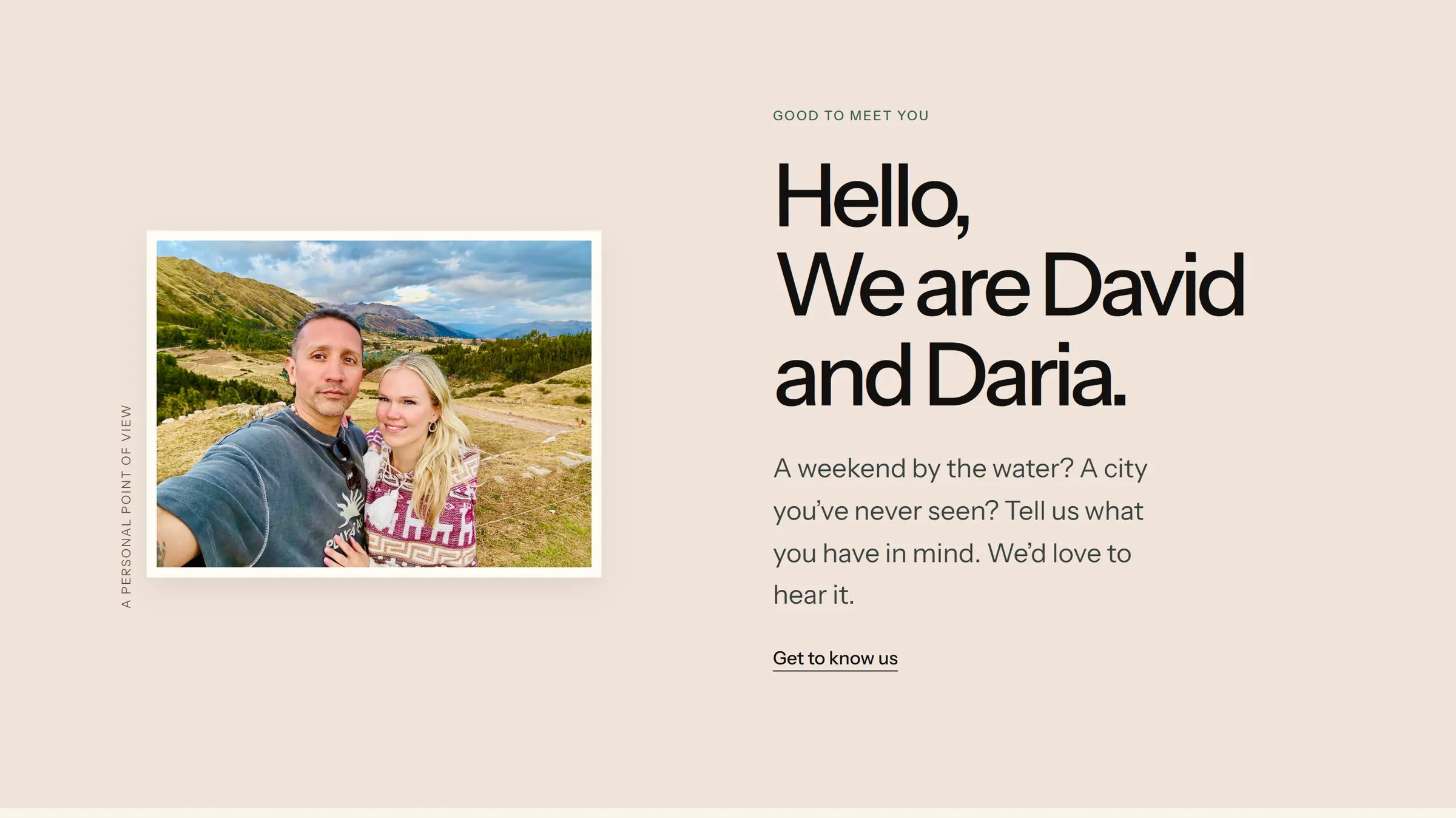
- The clients’ own photographs, given careful crops.
What shipped
- A journal that opens on load
- Chapter transitions: a plane on a drawn route, a woodcut sun chosen from three versions, a landing ticket
- A stamp sheet of every country
- Six revision rounds, each turned around the same day
Does your practice have a question like this one?
Tell me what is not working on a 20-minute call. Or start with a website check: I walk your whole path from search to booked, then send a ranked list with a fixed price beside each fix.
Replies within one business day